
A New Color Under the Sun-?
Updated: 1 hour ago
An essay on the nature of color- anything new? Brian Keeler
Imagine a new color- what could it possibly be? Would we have to expand the color wheel and insert a new hue? These are some of the questions posed from a couple of sources, most recently in an article by Rivka Galchen in the New Yorker Magazine- July 27,2026.
As a painter the idea of a new color is certainly intriguing but I suspect the results are more commonplace than is suggested. For new colors could be created all the time in the process of mixing paint, it seemed to me. The title of Galchen's article was, "Picture This- What Would it Mean to See a New Color?" So the idea of a message and meaning inherent in a new color also has its own intent and assumptions. Namely that a color, isolated and out of context or relation has a significance.

Above- a painting by the author using his color sensibiliites to portray the landscape- in this case a view over Keuka Lake in upstate New York. This 30" x 36" oil on linen on panel is titled,"Summer Sequel- Keuka." This painting uses a predomininace of cool hues- blues and violets. They are contrasted with warm yellow in a system referred to as a dyad or two-color composition of opposites on the color wheel. The painting below uses all warm hues.
To view a video of this painting being created in front of an audience the Gmeiner Art Gallery in Wellsoboro, PA- go to this link- https://youtu.be/VCqk7AUn6OE?si=m9zC34eKtWoj_Kc3
Hues in Context-
Most recently, while traveling in Maine in late October the landscape seemed to team with a wonderful panoply of deep warm hues. It felt like I was seeing a new version of Autumn- with wonderful deep rusts, russets and maroons predominating like never before. The hues being appreciated in Maine and here where we live are taken in context of the landscape. In Maine, the fields of blueberry shrubs, ground height and in bushes offered the land a covering in patches and patterns quite unlike the verdant greens of summer or the parched hues of dried grass in winter. Think of Andrew Wyeth's understated and austere compositions of low chroma hues, so as to accentuate the form and drawing - not the color.
The article in the New Yorker was much less enthralling than the title suggested. It dealt with the science and physiology of stuff like rods and cones in the eye and data of tests. As the author suggested succinctly, The "blah, blah, blah" of wavelengths, and the biology of the human eye.
The article centers on the work of a computer scientist at the University of California at Berkeley, whose name is Ren Ng. Yet as you will see, there were some engaging takeaways from that article.
Here's what the author stated as his assumptions about color-
When I first read about Ng and Roorda’s work, I tried to visualize what it would mean for there to be a new color. Where would it go in a color wheel? If you think of color as a property of a specific wavelength of light—which is how I thought of it—then you run into the impossibility of there being a “new” visible wavelength.
To get away from the nerdy science and the stuff of optometry and laboratories there is something for us artists and appreciators of art in this contemplation. Firstly, there's an intriguing bit that is similar to the Fauvist school of art, that asked the artist to paint the purest or most intense version of the color that was being observed. We think of the wild canvases of Vlaminck and even Seurat at the end of the 19th century.
Here's a passage from the article that addresses this-
The effect is candy-shop colorful. The door’s background hue, which Kreimer said was battleship gray, looked violet to me. When he painted the door, he was “thinking about how neutrals make a small amount of saturated color appear more colorful.” He added, “I wanted to judo color—get the maximum chromatic effect with the least color.
I followed Kreimer up narrow stairs to his studio, where he walked me through some of his favorite books and lectures, focussing on those that would illuminate the idea of a green of unprecedented greenness. “There’s hue, value, and saturation,” he said—the three dimensions of color as they are generally thought of today. Hue is color, as in orange, yellow, red, etc. Value is how much white or black is present. Saturation is often described as brightness.

Above- A plein air study, 18" x 20" of October light by the author done in Corea, ME. This painting uses a palette of warm hues whereas the previous painting employs color leaning toward the cools. To view a video of this painting in the early stage on location go to this link- https://youtu.be/BFtklF2zQSM?si=o7u-pTtYQgYQ0azV
Color and Light-
There is the color- and there is also light. As with the above painting of coastal Maine the light is the subject, the context is the setting and seaon, and the color could be thought of as the vehicle for conveying the impression. Taking color independently and out of the realtionship to the setting - as being done in the New Yorker article seems to miss the point to a certain extent.
There is another engaging parallel to an idea of Joseph Itten that I have conveyed in both of my books about painting. This being the idea of the color sphere instead of a color wheel. Here is a passage from the New Yorker article that addresses this.
The first color wheel, developed by Isaac Newton, in 1666, is a circle comprising seven wedges, each a hue of the rainbow as he (somewhat mystically) divided it: red, orange, yellow, green, blue, indigo, and violet. There is no pink, because pink is a red of another value. The German Romantic painter Philipp Otto Runge captured an additional dimension of color in his color sphere, which places hues at the equator, with the varying values of those hues becoming lighter or darker in respect to white at one pole and black at the other. The third dimension of color, saturation, is the variable that Ng and Roorda would play with in pursuit of a green of supernatural intensity. Intuitively, we tend to experience saturation as the purity of a color.

Above- a page from the author's recent book on painting, Dramatic Color in the Landscape- 2nd Edition - also in Keeler's other book, Light on the Figure.
To view a video on this concept of the color sphere by the author- go this link-

Above- The author's sketch of the color sphere-

Above- a page from the author's new book, Dramatic Color in the Landscape, 2nd Edition. It illustrates the idea of the color sphere and how color mixing can go through the center ( or across the equator) (or from pole to pole) between black white or any oppositions.
The Quotidian Quotient of Color-
So in our everyday life, (the Quotidian) color is such an inherent part of the process of living that it takes concerted effort to see the truth of color or at least appreciate it. It is like the fish trying to discover water- meaning that it is such an intrinsic part of life that we cannot separate it out.
Still, there is an example of a type of new color that has come on the scene in recent years, Perhaps it is more of a trend toward a family or type of color. I am referring to the penchant in several car companies to use a group of underwhelmed neutrals for the finish. These muted, greys, mushroom like hues and background like colors have struck a chord with consumers or maybe they are being foisted on the public. These hues are also noteworthy for being devoid of the metallic sparkle on most car finishes. The effect is to render the cars as if made of plastic. I refer to some as battleship grey or gunmetal cold. You've probably seen them too as their hard to miss- even in their non-assertive nature.
In regards to Johannes Itten there is an amusing little anecdote in that article that I found interesting describing his contemplative and monastic-like demeanor. Here it its-
Kreimer showed me a painted twelve-square-by-twelve-square grid from the 1961 book “The Art of Color,” by Johannes Itten. Kreimer described Itten as a “monkish guy who would shave his head and wear robes at the Bauhaus.”
Trompe L'oeil in color or Ocular Proof
As a serendiptious moment- to underscore my essay here, on my walk up the road near where we live in the waning light of a late October day, I experienced one of those Trompe L'oeil or fool the eye moments of color. When I began the sky was overcast and temperature still warm for this time of the year. So I was not expecting the color of the departing sun to set a glow on the colorful trees along the road. But as I was beginning up the hill I noticed what I thought was the effects of someone painting a flourescent spray of orange on the trunks of the trees. And I wasn't wearing my sunglass clip-ons to accentuate the color. It was a soft color and seemed only in a certain area and it matched the intense chorma of the leaves. Then, as I turned to look back, the sky was effulgent with a soft pinkish orange coming through grey clouds, like the sky of a Hudson River School artist.
So I had "ocular proof", as Shakespeare's charcter demanded in Othello. And this aha moment of how the eye was fooled by the expectations was corrected by further observation.
Civil disobedience in color?
To invoke Henry David Thoreau here as an arbiter may seem an odd thing and yes it is a bit of a stretch out on a limb. Still we need some civility to allow for the subjective in color. The upshot of the mentioned experiments by Ng as conveyed in the article is the color "olo," But many are nonplussed and are not convinced that this is truly a breakthrough.
Even in our everyday discourse or conversations about color we disagree. The nomenclature of color is notoriously at the whim of- who knows who. Perhaps designers, maybe interior decorators or paint manufacturers are to blame. A yellow ochre on one tube of paint may be more like a raw siena on a tube from another company. As the saying goes, "One man's mud is another man's chroma." Or so an art director in NYC told me many years ago.
The Denouement- Or Unweaving
Untying the color knot ( denouement) or better yet the unweaving of the rainbow seems a better way to sum up this penchant for finding a new color. As it is fascinating in certain sense but is it misplaced? All this science and data to come up with a new color. It is better to appreciate that rainbow rather have endless lab tests to analyze it my opinion. And perhaps more awe and less number crunching would be the course
Two books that I'm reading now have content that addressses this. One by Mary Beard, "Talking Classics" brings up the idea of "Thauma" about the ancients- which is a sense of wonder the other titled simply "Awe" by Dacher Keltner. The later however finds it necessary to site lots of lab work and science as justification for this simple human emotional response to the visible and visual delights.
An excerpt from an Emily Dickenson poem is a good way to end
There's a certain slant of light
Winter afternoons-
That oppresses like the heft
Of Cathedral tunes
Heavenly Hurt, it give us
We can find no scar,
But internal difference-
Where the meanings, are-
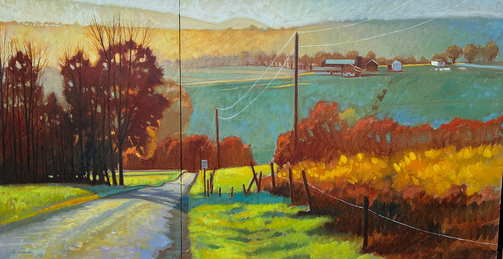
Above- a lare diptych (Two panel) oil by the author depicting a landscape at Homet's Ferry, PA near Wyalusing, PA. This painting uses a dyad system in the organization of the color. This two-color approach here is the near-compliments of blue green hue and the orange-ish hues and rust colors of the trees and brush on the right. This 30" x 56" oil on cotton is titled, "Autumn- Homet's Ferry, PA."

Above - The cover of Keeler's new book on paintint. It is available at the North Star Art Gallery in Ithaca and at the West End Gallery in Corning, NY. It comes in a hardcover, paperback and E-version. The Kindle or e-version has links to dozens of videos allowing the reader to view the paintings being created on location.'
View a video introduction to Keeler's books here- https://youtu.be/F0EFkIdzK4I?si=nQqwmrm_ld0w7eaj
Order it direct from Amazon here- https://a.co/d/0dkSel1f


Comments